New Alpine Club of Canada Logo
Beautifully designed, it encompasses both history and future, the ACC launches a new image

The world is changing more quickly than ever before and the Alpine Club of Canada (ACC) is evolving
with it. We know that in order to stay relevant, we must step boldly into the future, keep up with
current technology and deliver programs that continue to meet the needs of our members. The last few
years have seen a number of major changes within the Club; and now we are taking another important
step in launching a new look for our logo.
“While the existing logo has tons of charm and tradition and has symbolized the great things about the
Club to so many people for a hundred years, the fact is that the old logo no longer represents who we
are presently or what we do.” said ACC President Peter Muir, “Coils of hemp rope and wooden ice axes
are just not what the ACC is about in the 21st century.”
One of the biggest issues with the old logo is the fact that it did not represent the two official languages
of Canada and of our club. The name of the Club is now included in both French and English, separated
by 1906, the year of the Club’s founding. Our logo must reflect the entirety of who we are today and
symbolize our dynamic future.
Changing something that’s so established and loved is a significant issue and one that the Club took very
seriously. We are proud of our rich history and the symbol that has represented us so well in the
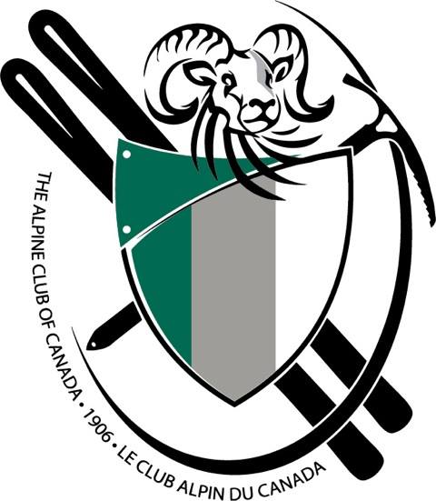
mountain community. For this reason, we decided that our new look would be a re-work rather than a
fresh slate, but one that represents the Club in a more modern light. In the new logo the ice axe, the
symbol of the alpinist, is a modern yet timeless design, and the second ice axe has been replaced by a
pair of skis. The hemp rope was removed. The sheep’s head has been reworked into a more abstract
look. The shield remains with the original colours of green, grey and white corresponding to the forest,
the rock and the snow and ice of alpine environments in which we play. The shield is overset with a new
panel, primarily in green, but it will also appear in alternate colours, representing different areas of the
Club’s work, which, as stated in our Mission Statement, is to foster alpine experiences, knowledge and
culture; promote responsible access; and support excellence in alpine leadership and skills.
As we look to the future and the exciting changes that lie ahead, the Alpine Club of Canada is proud to
unveil our new logo that represents our Vision, Preserving, practicing and promoting Canadian mountain
culture and self-propelled alpine pursuits, and our members from coast to coast to coast.

ABOUTTHEALPINECLUBOFCANADA:
TheAlpineClubofCanadaisCanada’snationalmountainorganization.BasedinCanmore,Alberta,the ACChasbeenafocalpointforCanadianmountaineerssince1906.Withregionalclubsectionsacross Canada,membershipintheUnionInternationaledesAssociationsd’Alpinisme(UIAA),year-round mountainadventures,andanextensivesystemofalpineandbackcountryhutsthroughouttheCanadian Rockies,theACChasgrownfromitsearlyinceptionintoafull-fledgedmountainorganizationwitha strongfoundationofvolunteer,professionalandcorporatesupport.FindtheACConFacebookand Twitter.
Check out the latest buyer's guide: